story of a brand being made...
This is Infamos Design™ — the brand created to capture our personality.
Built to reflect what we’re all about: clean design, bold ideas, and a playful edge. Every element, from colour to type, is crafted to feel unmistakably us.
If you're the “show me the finished product first” type of person, the brand guidlines have you covered.

Why Infamos Design?
The name Infamos is a playful twist on “infamous” — bold, memorable, and a little cheeky — but it also nods to my own name, Amos. It felt like the perfect fit: personal, confident, and with just the right amount of mischief.
Infamos Design™ captures everything I believe good design should be — simple, striking, and full of character. Built around clean thinking and playful creativity, it’s a brand that feels human, confident, and, most importantly, me.
Visual Direction
The visual direction for Infamos Design™ is built on the idea of minimalism with personality. Every element has room to breathe — clean layouts, bold type, and bright colour moments that bring energy without clutter.
It’s about finding the balance between serious thinking and playful expression — creating visuals that feel smart, approachable, and unmistakably Infamos.

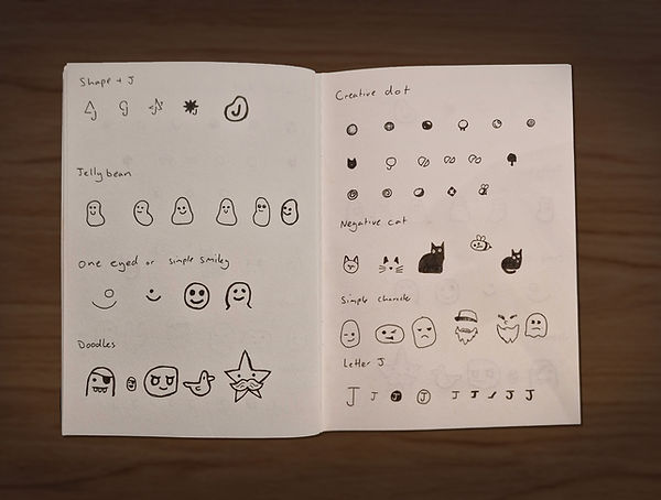
Building the Brandmark
The brandmark started before the name existed, sparked by sketches and playful doodles. These early drawings captured the personality and energy I wanted for the brand, guiding every decision.
From Sketch to Screen
Once the ideas were sketched, I brought them to life digitally. Each doodle and icon was refined, adjusted, and polished to create a versions that were clean, versatile, and full of personality — staying true to the playful energy of the original sketches.


Finalising the Brandmark
The result is a mark that’s bold, approachable, and full of character — a playful visual signature of me that feels human and instantly recognisable.
Shaping the Wordmark
Before the name even existed, I was exploring the look of the wordmark. I started by hand-drawing my own name, sketching out letters and experimenting with lines that felt playful yet confident.


Making Joelmus
From these sketches, Joelmus was born — a custom typeface that captured the personality I wanted for the brand. It’s human, approachable, and full of character, giving the wordmark a unique voice even before the name came to life.
Created using FontForge.
Planning the Guidelines
With the brandmark and wordmark taking shape, it was time to define the system that would keep Infamos Design™ consistent across every touchpoint.
The planning stage focused on the essentials: colour, typography, spacing, and tone of voice — the building blocks that give a brand personality and presence.


Finding Our Voice
With the brand taking form, the next step was to discover how I actually speak as a brand. I worked to find the sweet spot between being clear, confident, and playful, to get a voice that feels warm and welcoming, but keeps the little spark of attitude.
Defining the tone of voice early meant every caption, headline, and message could feel like it came from the same playful personality.
Settling on the Name
Somewhere between sketches, colour tests, and too many cups of coffee, the name clicked. Infamos Design just felt right.
Playful, memorable, and proudly a little unexpected.
With that sorted, I locked in the wordmark using Joelmus (and later Satoshi) — then gave it a light sprinkle of playfulness for good measure.


Cracking Typography
With Joelmus set for the wordmark, it was time to give the body text some personality too. Enter Satoshi. Clean, flexible, and just the right amount of serious to balance the playfulness of the brand.
I fiddled with spacing, nudged kerning, and tested leading until everything felt just right. The goal? Text that’s easy to read, confidently structured, and still full of character.
Choosing the Colours
By this stage, I had a rough idea of the colours, but it was time to lock them in. Working from Pantone colours ensured consistency across digital and print.
At the heart of the palette is Abi Yellow — named after my wife and impossible to ignore. Pukeko Blue was inspired by the uncanny resemblence to a pukeko's colurs, whilst tying in where I call home, New Zealand. Chalk White, Ink Blue, and Velvet Pink add clarity, depth, and little bursts of personality.
Together, these colours keep the brand playful, bold, and unmistakably Infamos.


Finishing the Brand
With the logo, colours, type, and more all in place, it was time to wrap everything up. The guidelines capture the playful, bold, and the distinct Infamos Design character — a toolkit to keep the brand looking and feeling consistent everywhere.